Too much to read. Too little reason to convert.
The original subscription screen tried to justify every plan with feature lists, marketing copy, and platform context. It worked in English, on one screen size, for one market. Everywhere else, it broke.
Long translated strings overflowed. Feature bullets that fit in English collapsed into walls of text in Japanese. Prices displayed in local currency meant nothing without context — ¥9,980 doesn't feel cheap or expensive until you know it's saving you 44%. Conversion was low and the design needed to work harder across every locale simultaneously.
"The problem wasn't that users didn't understand the product. It was that the screen made them work too hard to understand the value."

// Feature-heavy layout — three columns, five bullet points each, repeated CTA per plan.
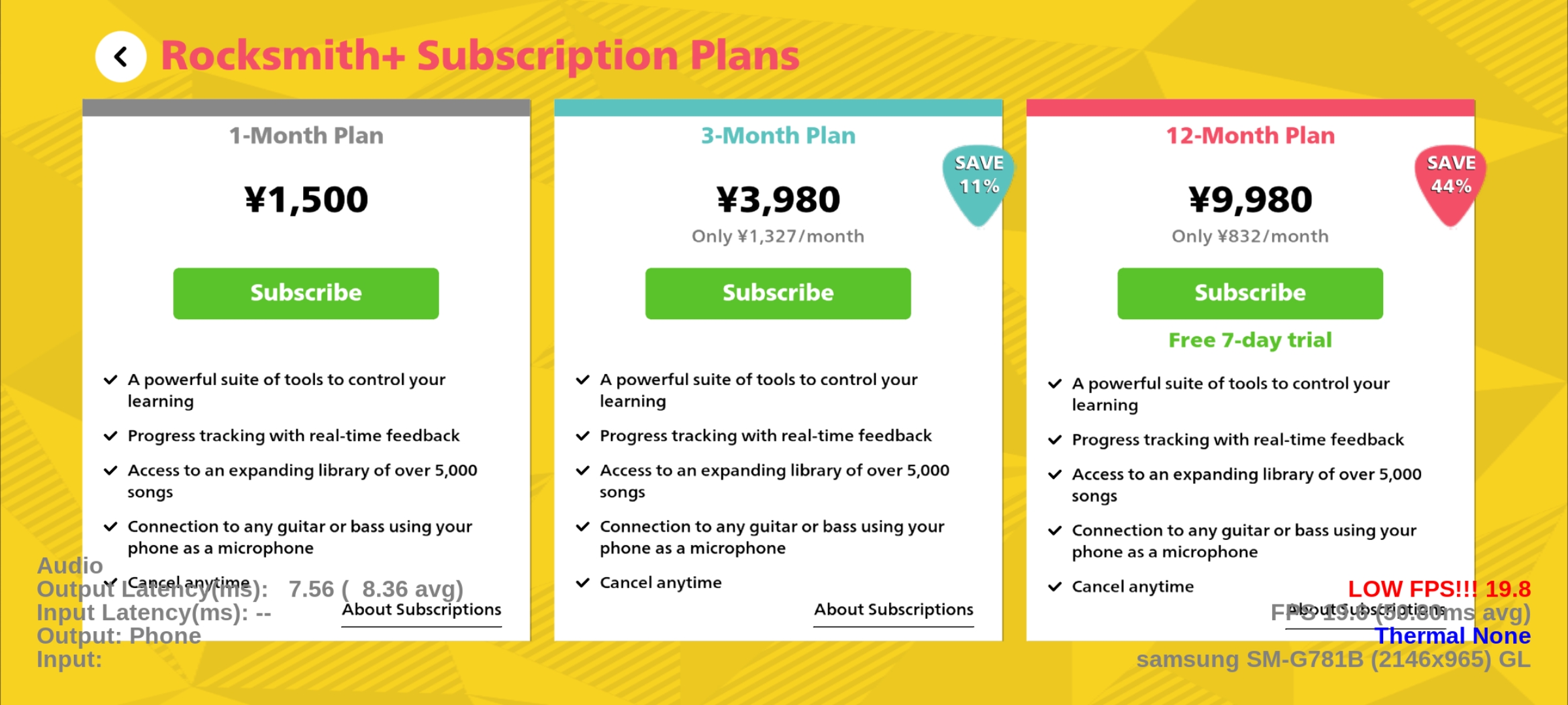
// Same approach on a different breakpoint — copy-heavy, decision unclear.
Price and percentage. That's it.
Users scanning a subscription screen make their decision in seconds. They're not reading feature lists — they're asking one question: which plan gives me the most value?
Percentage-based savings answer that question universally. "Save 44%" is legible whether the price is $99.99, ¥9,980, or €89.99. It doesn't require currency knowledge, market context, or mental arithmetic. The redesign stripped everything back to the two signals that actually drove the decision: the price, and how much you save.
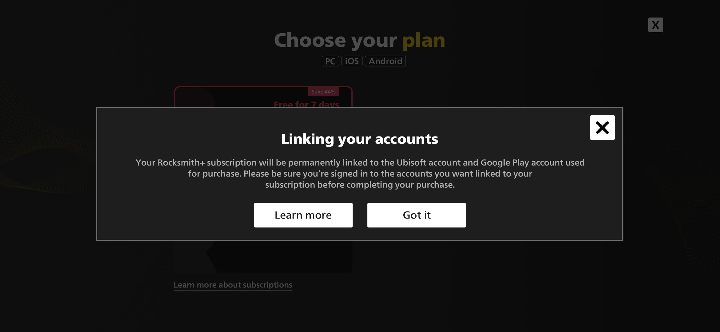
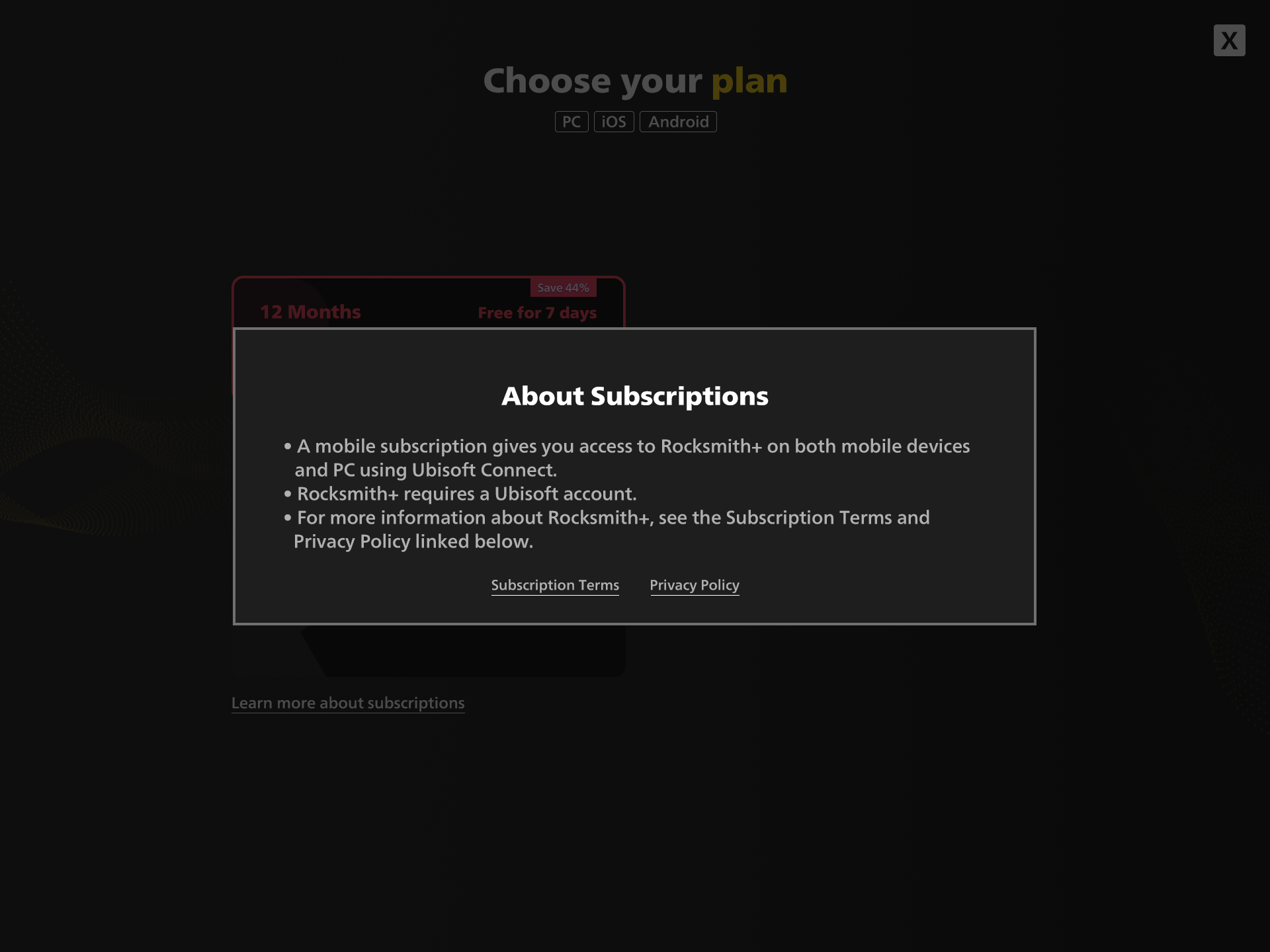
Supporting information — account linking, subscription terms, bonus offers — was moved into contextual modals. Available when needed, invisible when not.
One design. Every screen. Every market.
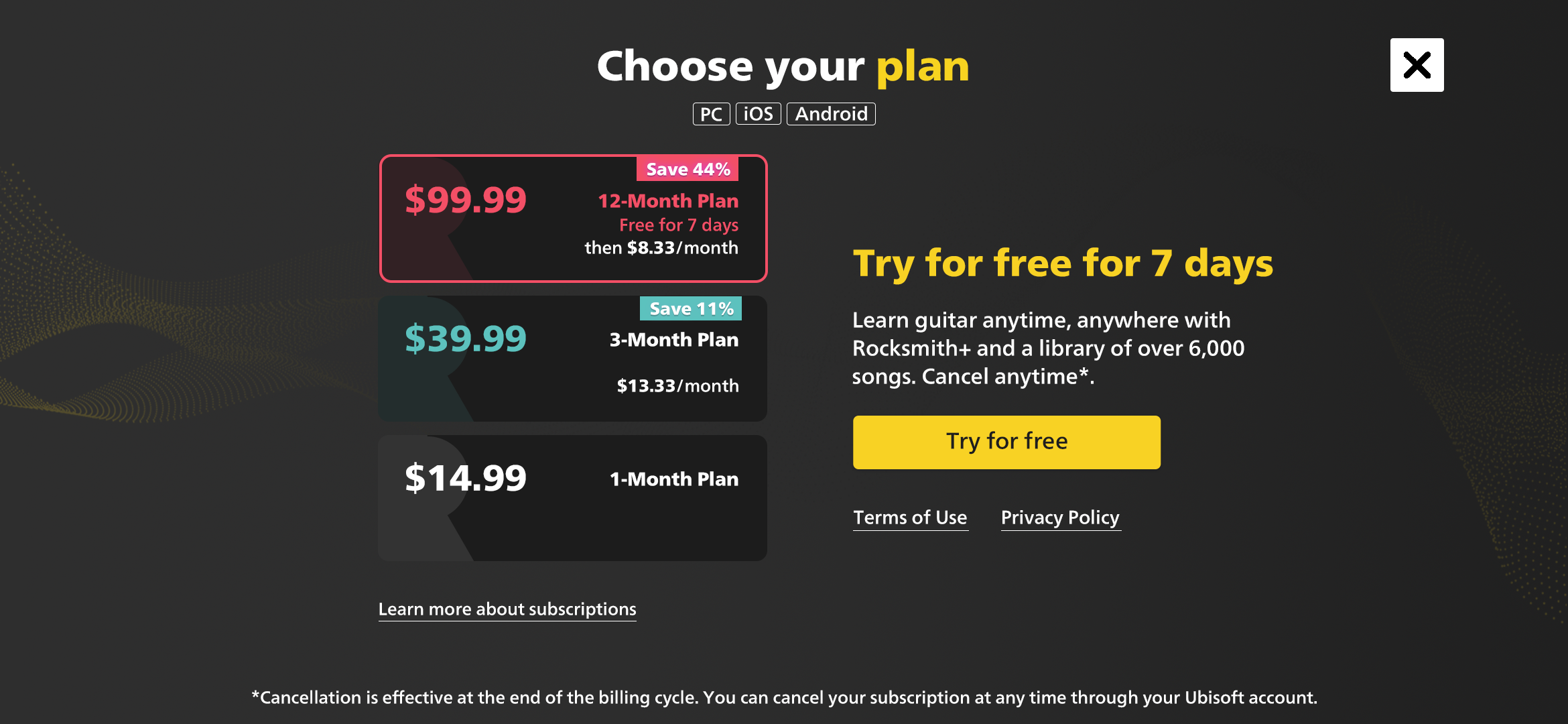
// Clean plan stack — price and savings badge front and centre. Single CTA.
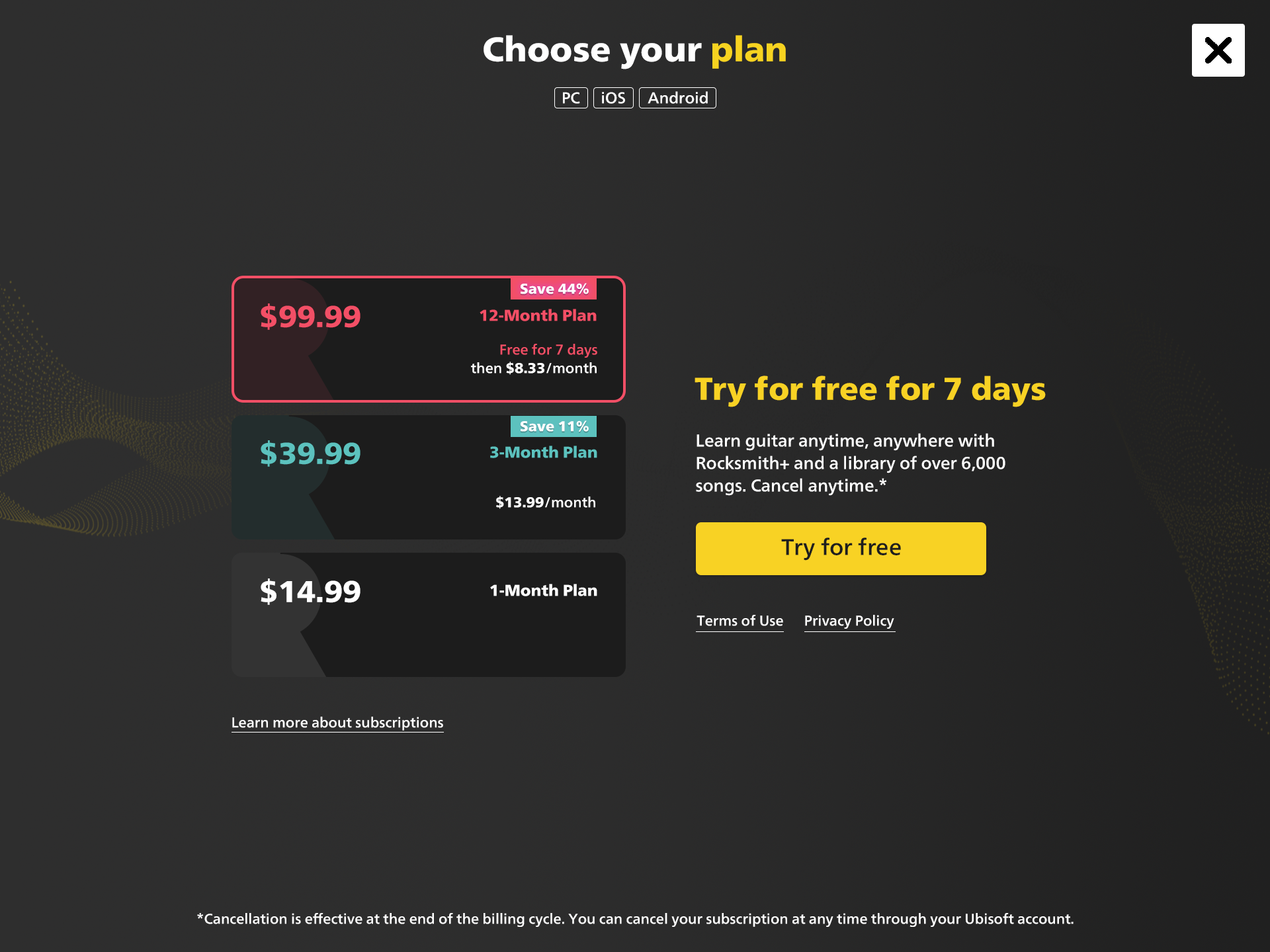
// Tablet layout — plan selector left, trial CTA right. Same hierarchy, more breathing room.
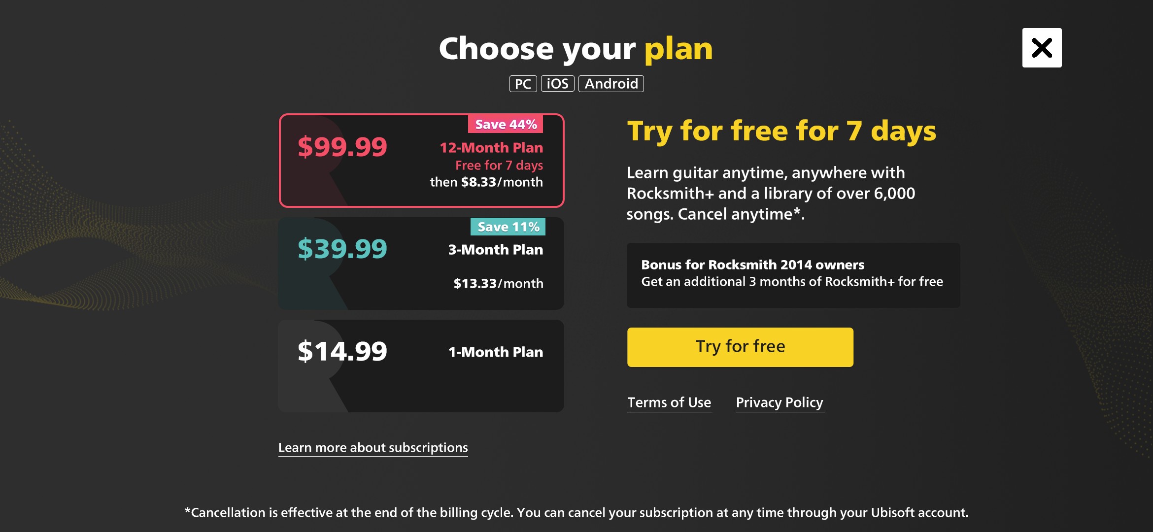
// Live interaction — plan selection, modal flows, and the full purchase journey on mobile.
Simpler to read. Easier to decide.
Single layout held across all markets and locales — no market-specific design variants required
Percentage-based savings made value universally legible regardless of currency or locale
Supporting information moved to modals — reduced cognitive load at the moment of decision
Layout held across iOS, Android, and PC without platform-specific redesigns