A system players couldn't read
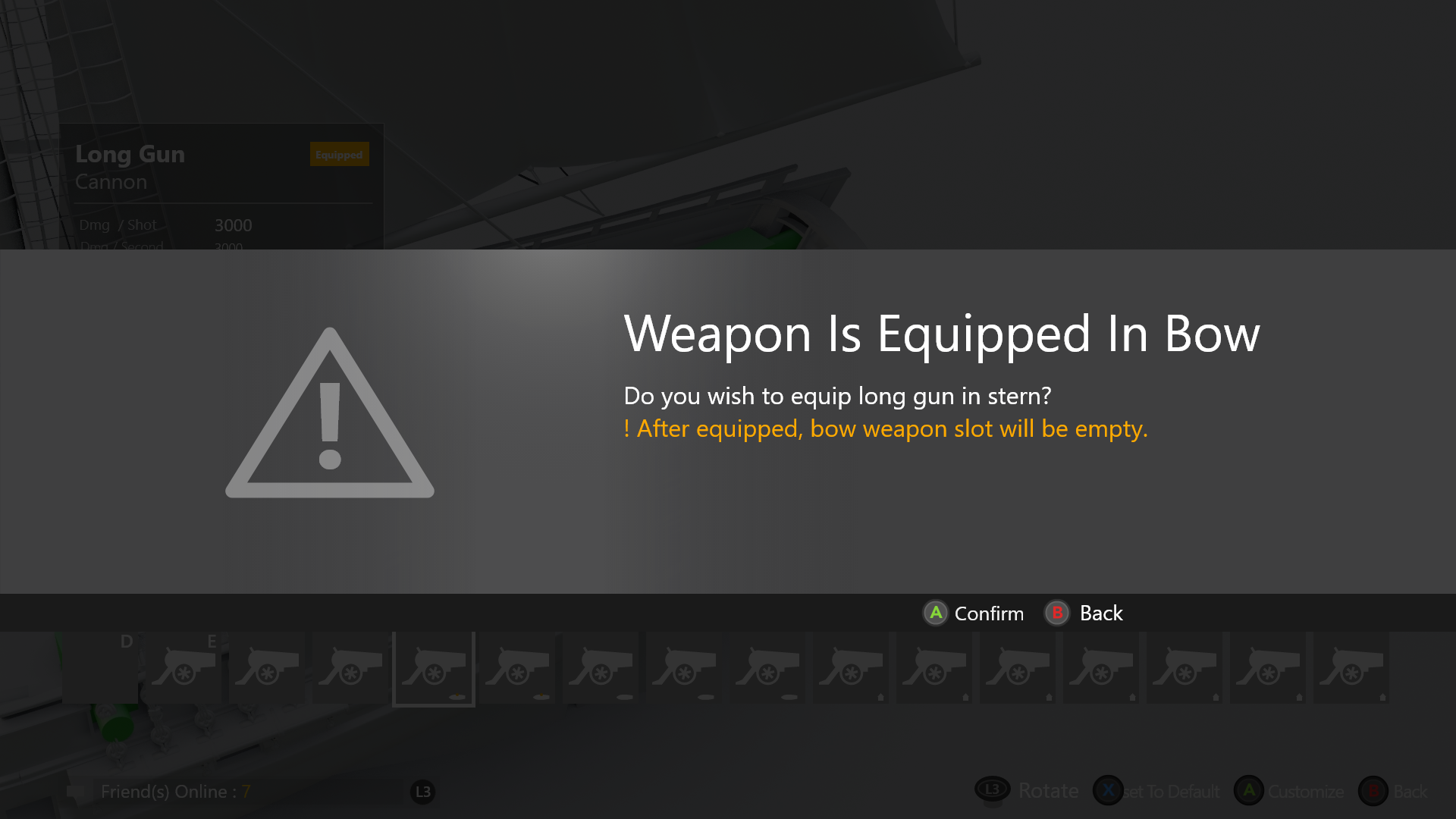
Skull & Bones has a deeply constrained weapon system. Ships have a fixed number of slots, weapons come in different sizes, and each combination changes your playstyle entirely. Players couldn't figure out what they could equip — or why certain options were unavailable.
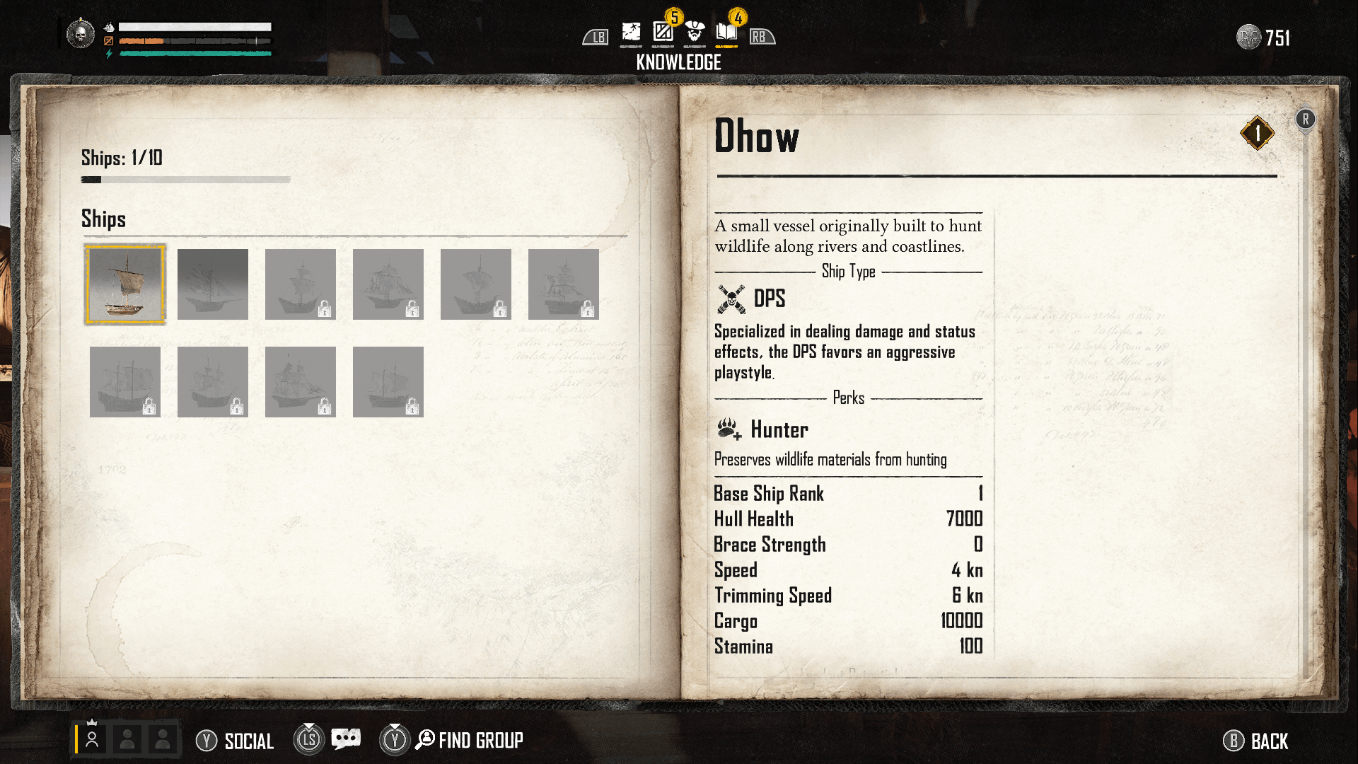
The information existed. The clarity didn't. And game designers — rightfully — needed all data visible. Stats, types, perks, compatibilities. That tension defined the design challenge.
"The data was all there. Players were overwhelmed by information that wasn't relevant to the decision they were trying to make."
Every screen between player and ship
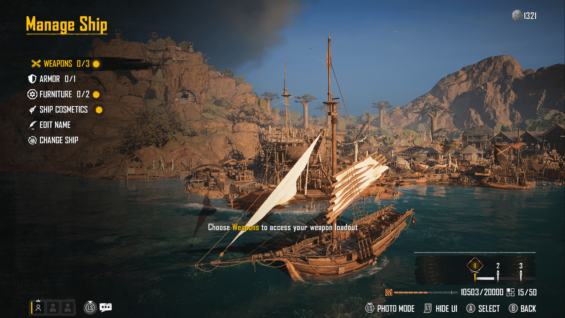
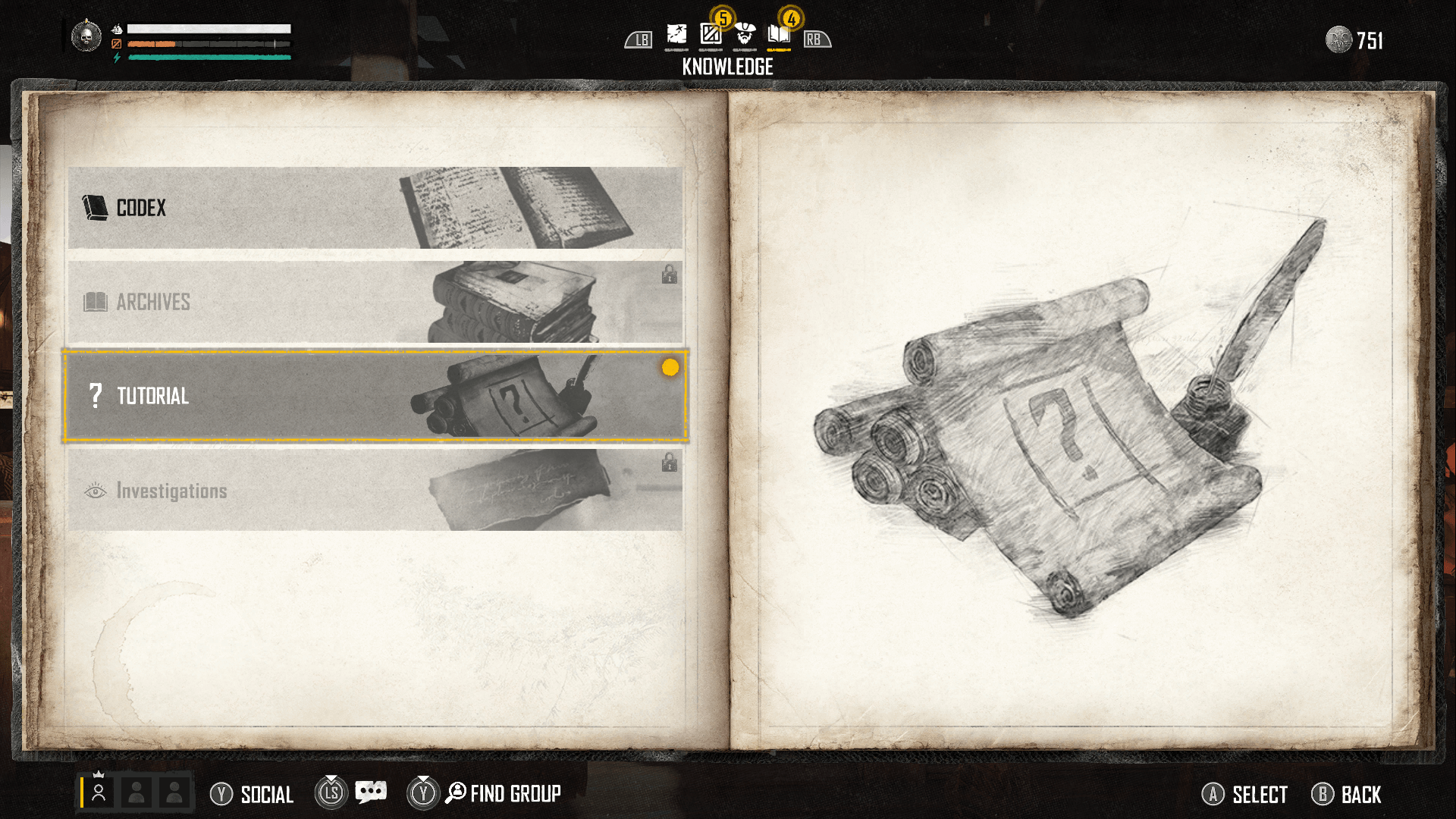
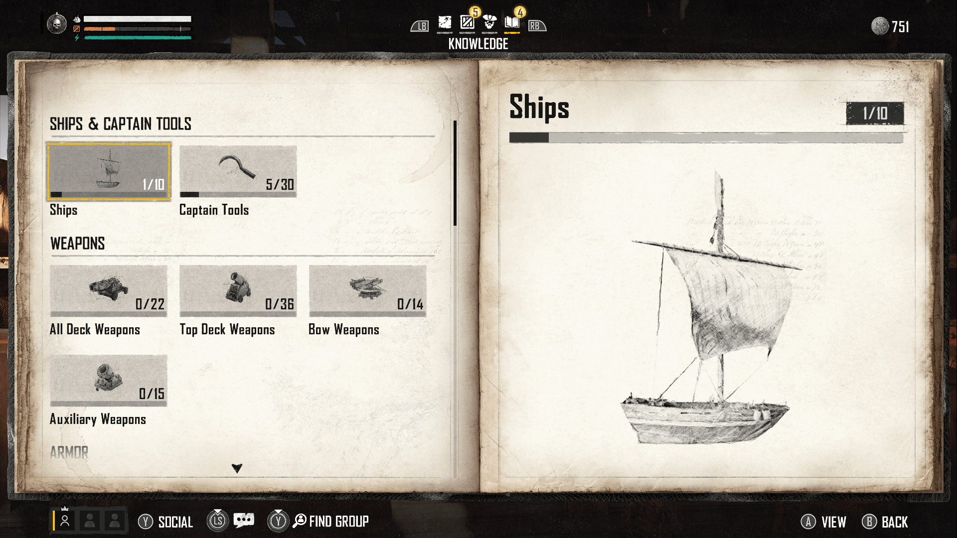
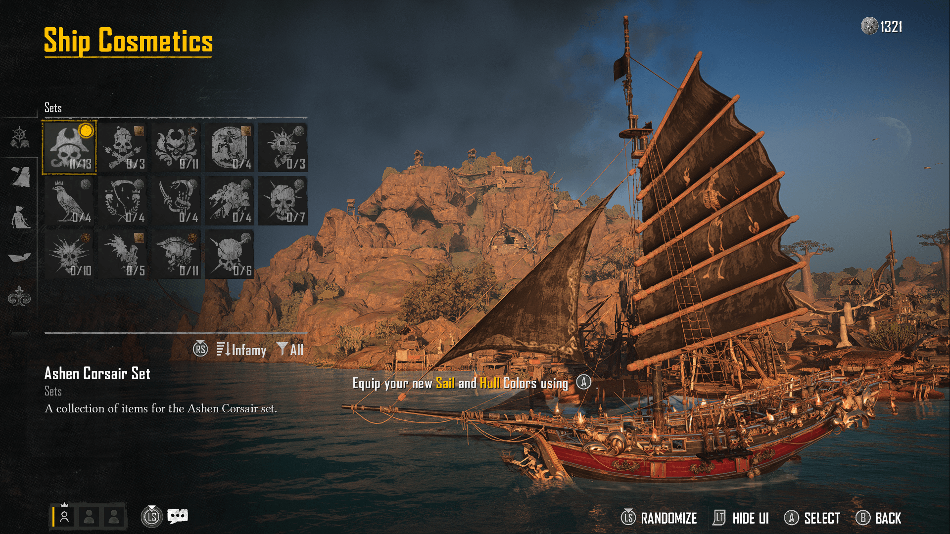
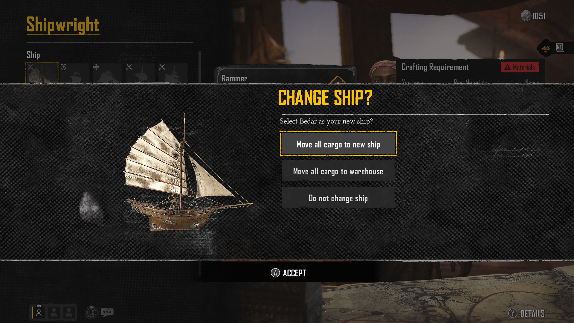
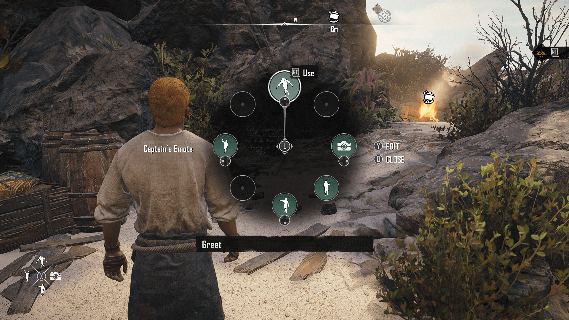
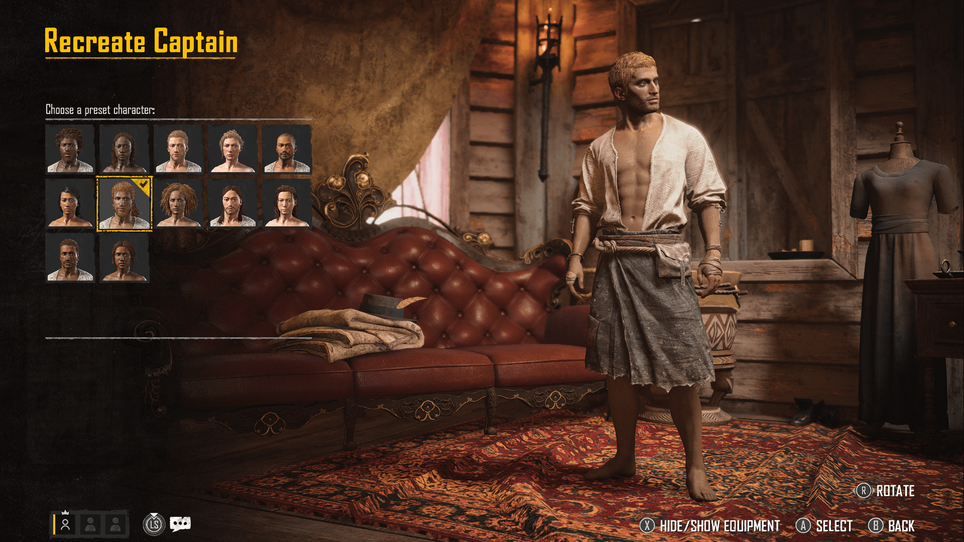
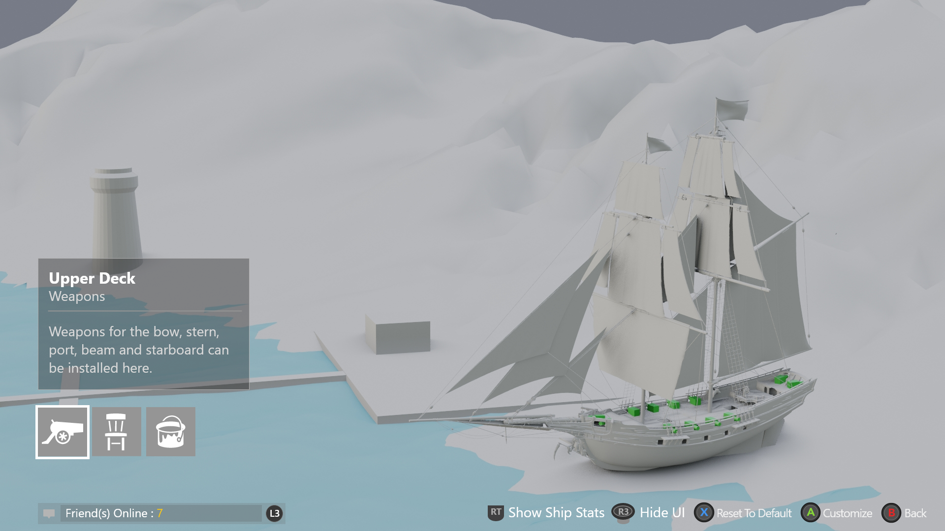
I designed the full customisation surface: the Codex knowledge system, the Manage Ship hub, weapon and armor loadout flows, ship cosmetics, the Change Ship confirmation modal, the emote wheel, and the captain recreation screen.
These aren't isolated screens — they form a system. A player deciding on a weapon needs to understand ship type compatibility, slot constraints, and stat tradeoffs. The challenge was making that legible without stripping the depth game designers needed.
One toggle. Two mental models.
After five major iterations — and real tension with game designers who needed full information present — the breakthrough was simple: players weren't overwhelmed by information. They were overwhelmed by irrelevant information.
A toggle between "compatible only" and "show all" resolved a team debate and respected two completely different user mental models simultaneously. New players see a clean, valid set of choices. Veterans can see everything. The Codex provided the depth — kept out of the decision moment.
Prototyping as the language of alignment
The design went through at least five major iterations. Early versions were dense — every stat surfaced, every option visible, the ship rendered in 3D with weapon slots highlighted directly on the hull. Playtest after playtest showed the same thing: players froze.

The tension with game designers wasn't about ego — they knew the system better than anyone. Resolution came through prototyping. One key debate: free cursor vs. controller-based navigation, with the ship camera responding differently to each. I built interactive prototypes of both so the team could feel the difference rather than argue about it.
// Cursor-based approach — free mouse movement over the 3D ship.
// Controller navigation — ship rotates to slot in focus, camera follows intent.
Seeing the difference shifted the conversation from opinion to evidence. We all wanted the same thing: a game players would understand and love. Prototypes made that shared goal visible.
Clarity that scaled
Eliminated invalid choices at the point of decision — players never hit a dead end mid-loadout
Design pattern scaled across live-service content updates without redesign
One toggle resolved both QA feedback and the internal team debate simultaneously
Codex system provided full information depth without cluttering the decision moment