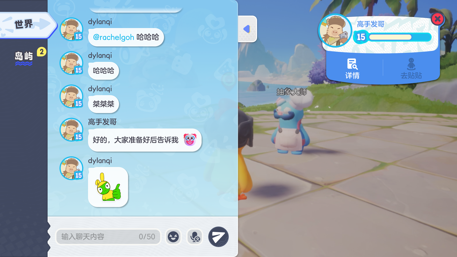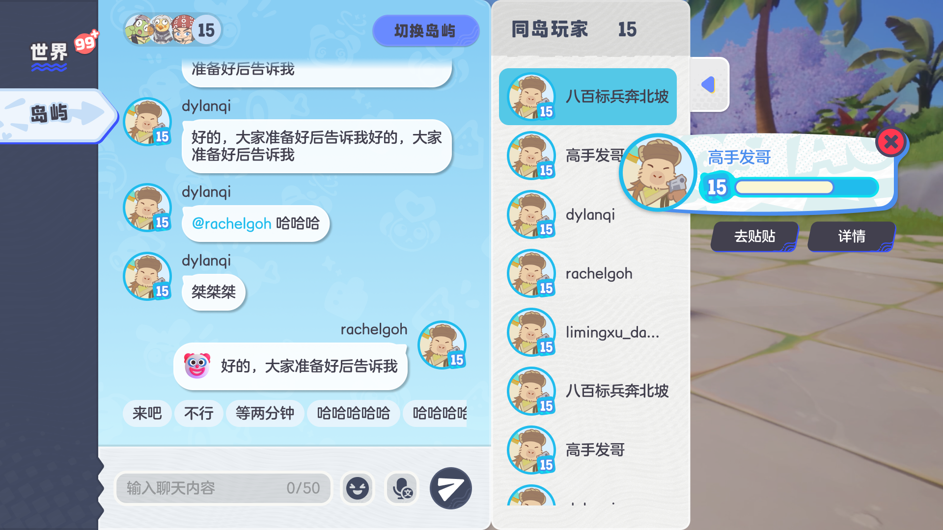
One chat system, many contexts — and no consistency
The game needed a full social layer in a month. The hard part wasn't the features — chat had to work across very different contexts: a sidebar on the island, a pop-up mid-match, positioned differently screen to screen.
Those inconsistencies, plus constant notifications, made the system easy to ignore. As sole designer, I owned it end-to-end across 10+ stakeholders.
"Same feature, different place, different behaviour on every screen — players stopped trusting where chat would even appear."
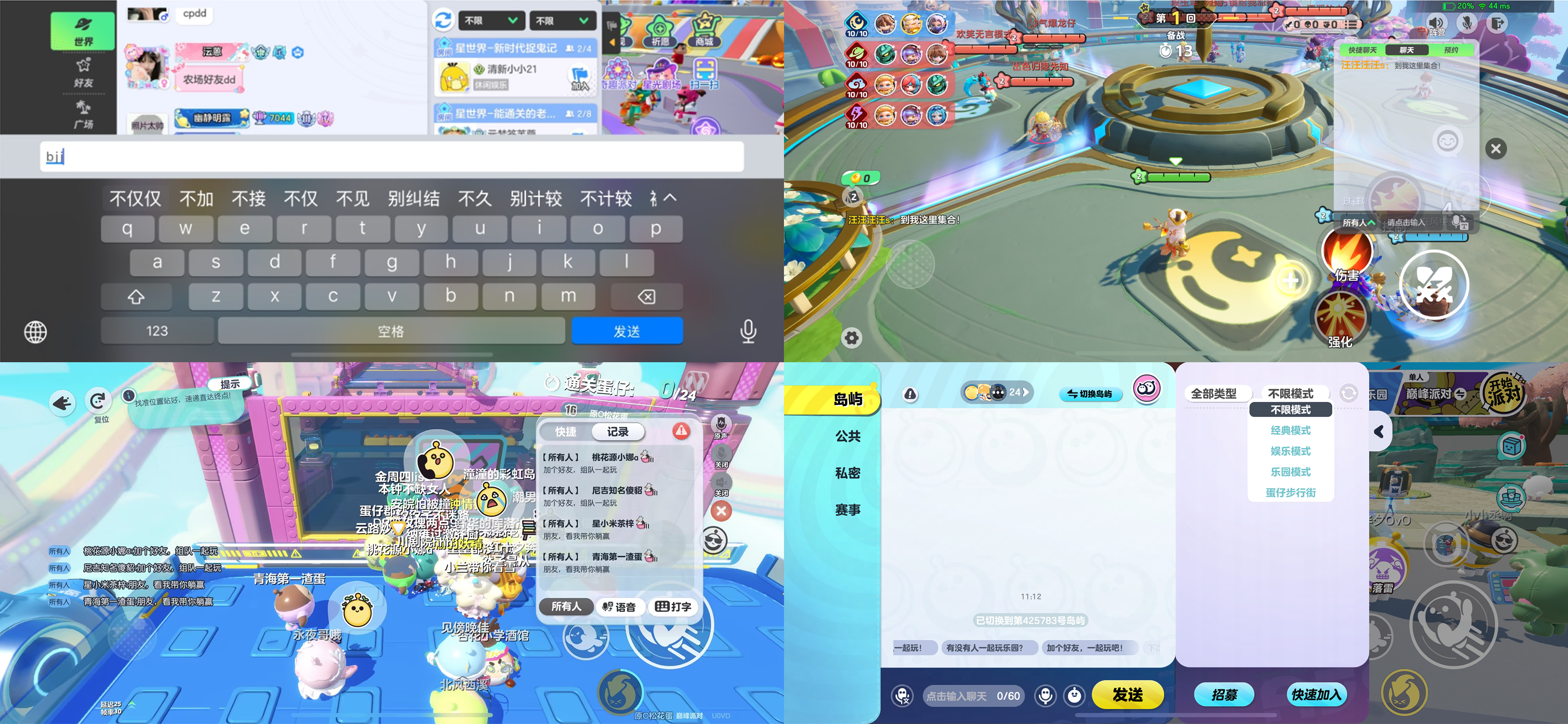
Same system, three contexts
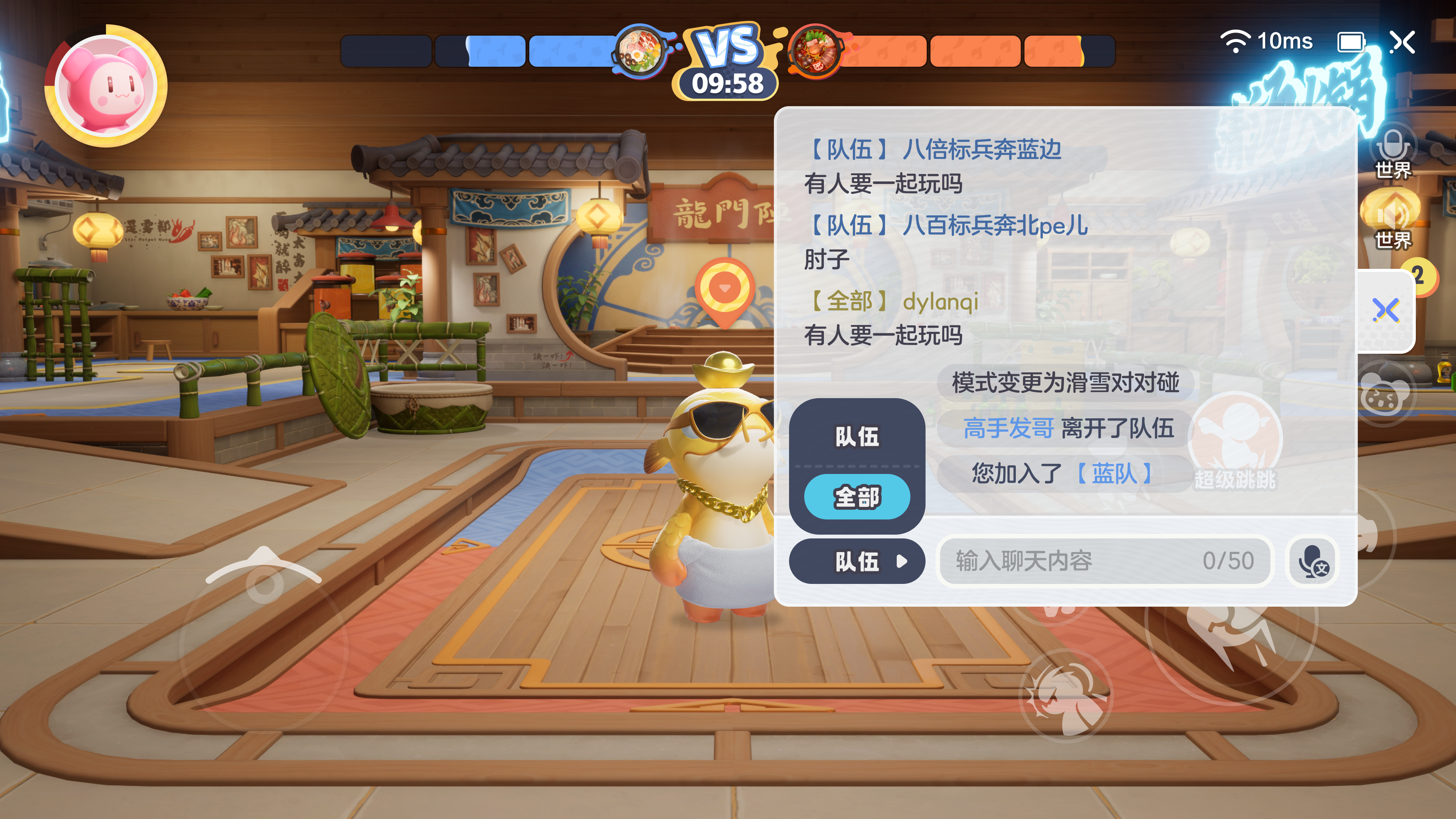
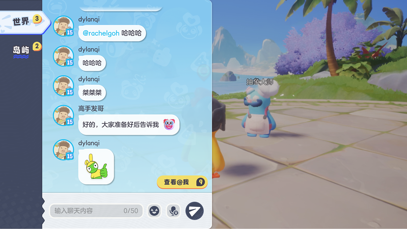
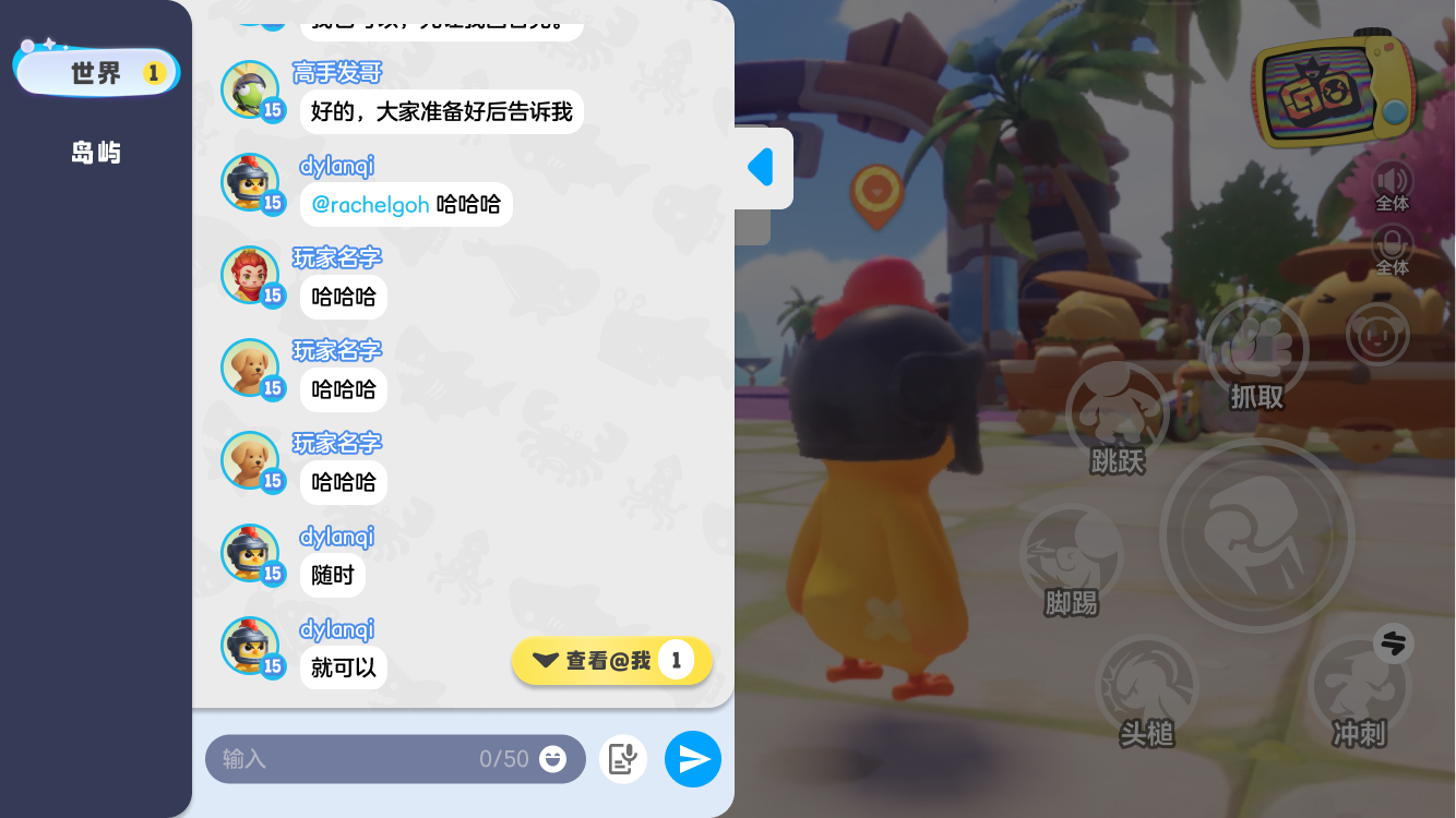
Chat lived in three contexts — Room, Match, and World — each surfacing two channels at a time. The same system had to feel native in all three: a full panel when idle, lightweight quick-access during a fast 10-second match.
I learned to align stakeholders earlier
With 10+ stakeholders, layout and button placement were debated heavily — chat popped up on both the left and right across contexts, so consistency was a constant fight that cost many iterations.
My honest takeaway: I hadn't aligned on goals early enough. Adding an alignment checkpoint upfront sharply reduced the back-and-forth later.
Designed for speed in fast play
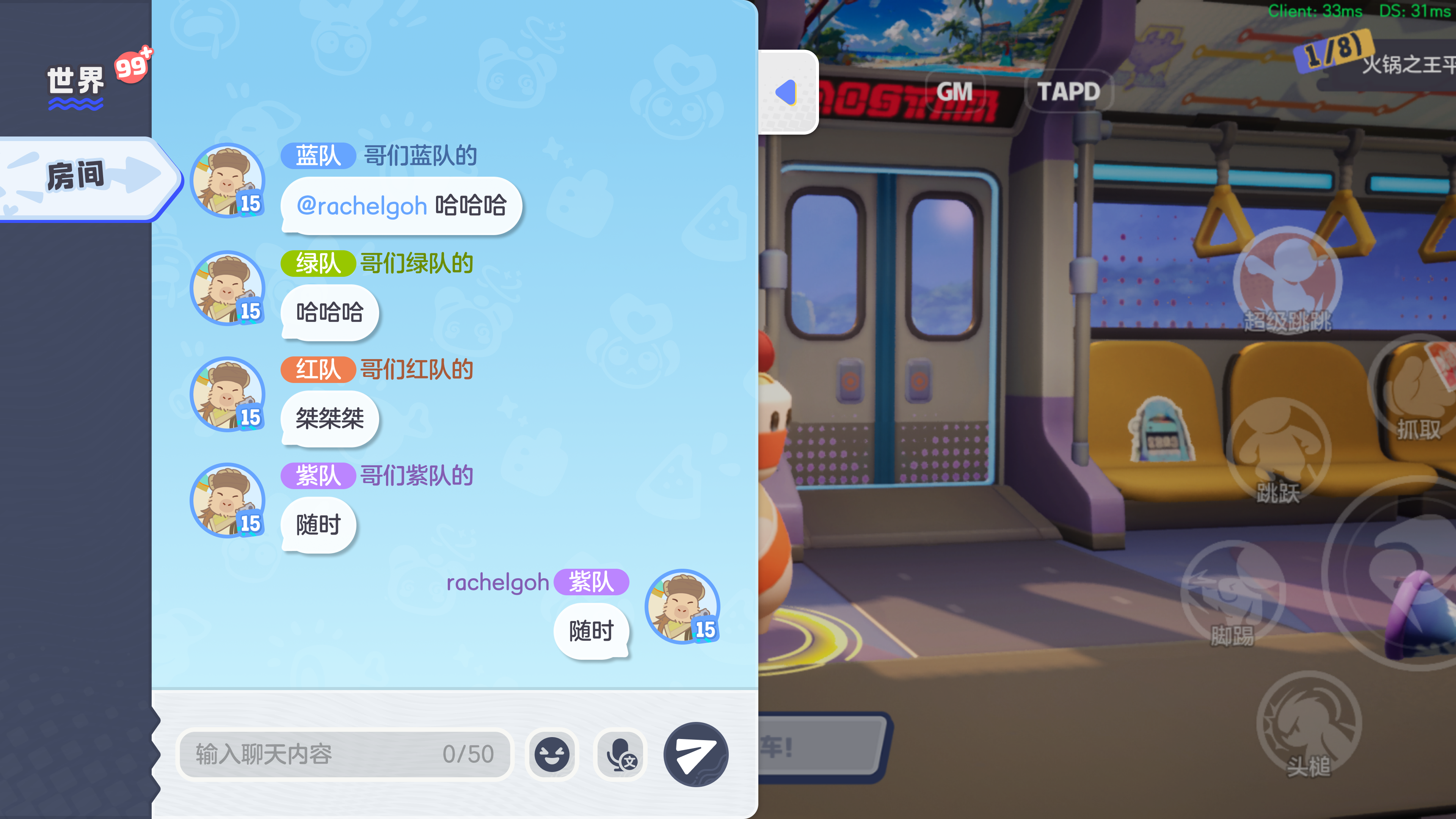
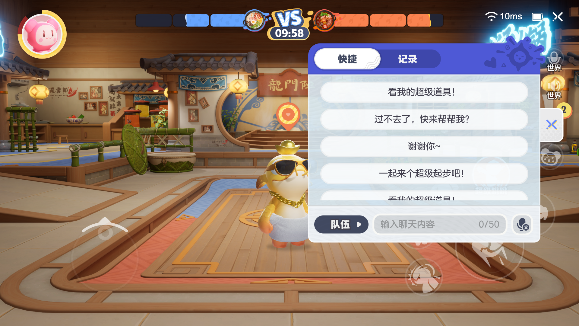
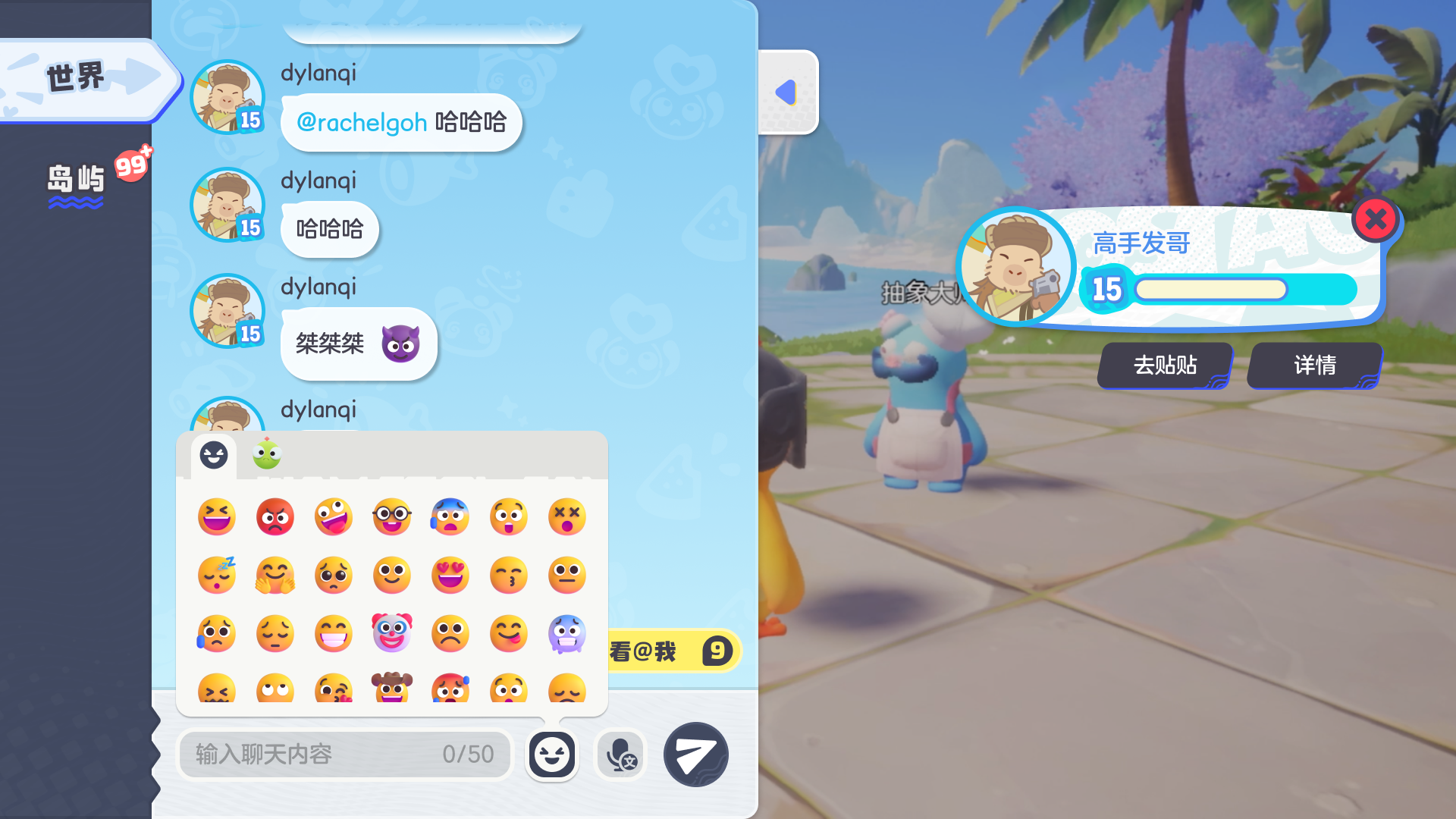
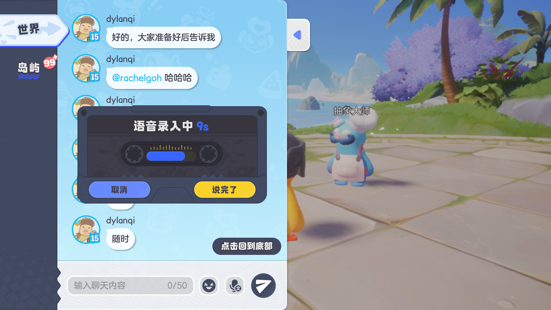
Free typing doesn't fit a 10-second match — so every input is fast and contextual. Rounded out with @mentions, tappable player cards, and team colour-coding.
Players actually talked
Meaningful engagement for a fast-paced game where typing competes with play.
One system stayed consistent across Room, Match, and World — chat behaved predictably everywhere
Speed-first inputs (presets, stickers, speech-to-text) let players communicate without breaking a 10-second match
An upfront alignment checkpoint cut iteration churn across 10+ stakeholders
Follow-on: stakeholders added a daily-gift events page to further drive chat open rates